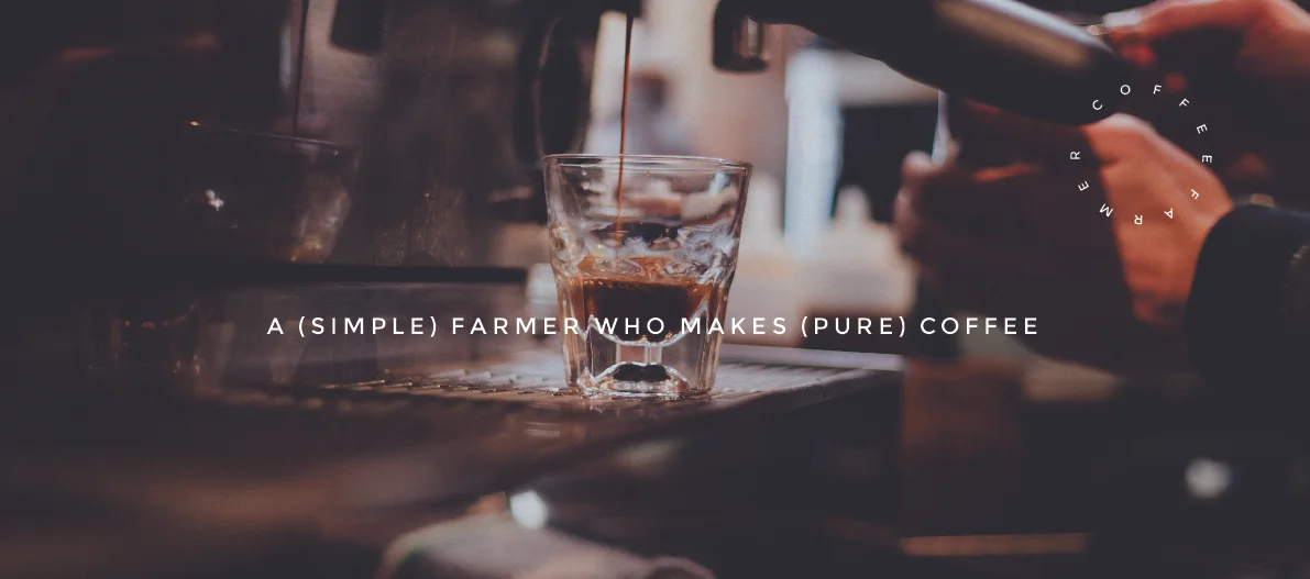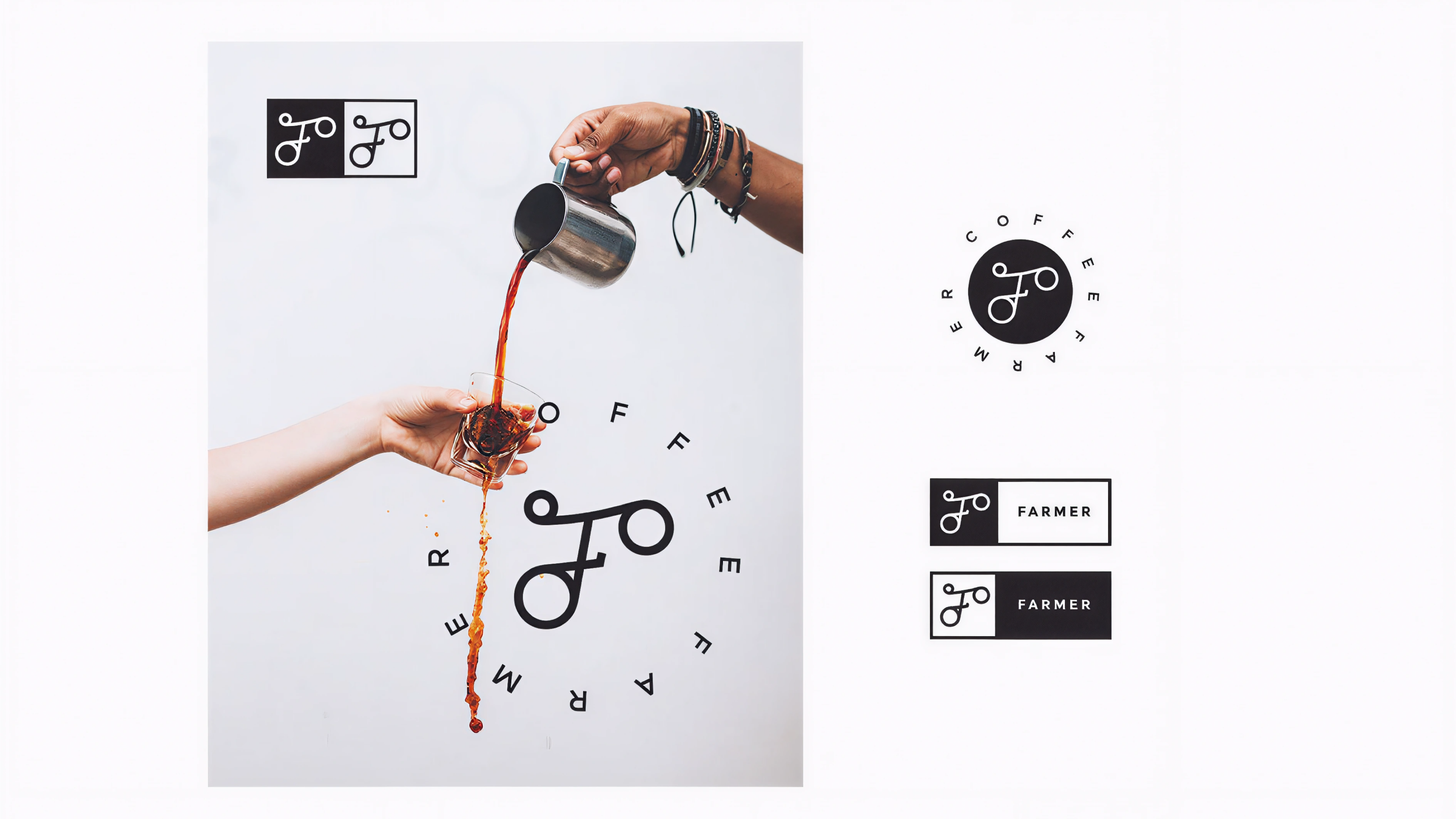
Farmer Coffee is a small café located in Shanghai, founded by a barista who proudly identifies as a farmer. Although he now works in a modern city, he sees no contradiction between his rural roots and urban lifestyle — instead, he takes pride in that identity. His philosophy is about craftsmanship, humility, and persistence, values that mirror how he makes coffee: patiently, manually, and with attention to every detail. My goal was to create a logo that visually connects this dual identity — a modern urban craftsman with a farmer's spirit.
During our conversation, the founder said: "I may live in the city now, but I'll always be a farmer — and I'm proud of it." That sentence became the soul of the logo. I wanted to capture this tension between rural roots and urban rhythm.
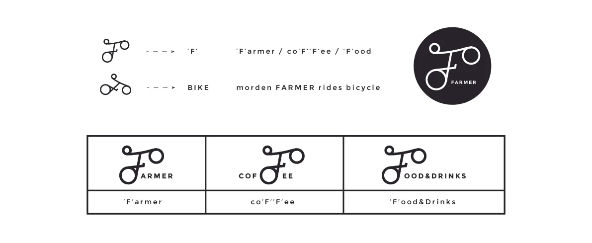
The word "Farmer" feels grounded, honest, and earthy. But in Shanghai, this "Farmer" rides a bicycle to work every day, symbolizing freedom, motion, and sustainability. So I began exploring how the letter "F" could visually echo the form of a bicycle — a minimal, continuous line that carries a sense of movement, balance, and human touch. The "F" became not just a letterform, but a symbol of mobility and humility — a farmer pedaling through the city.
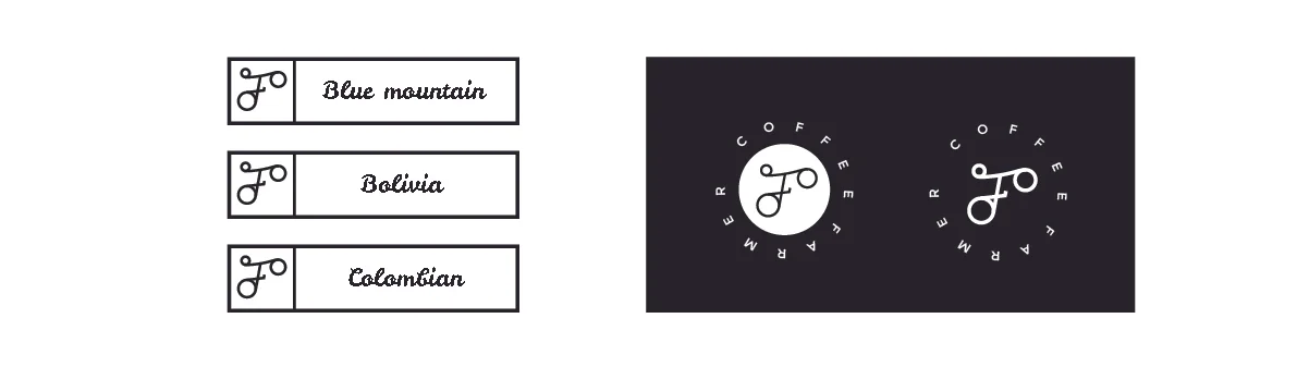
Started from hand-drawn variations of "F" that could resemble a bicycle frame or handlebar. Explored the balance between readability and symbolism.
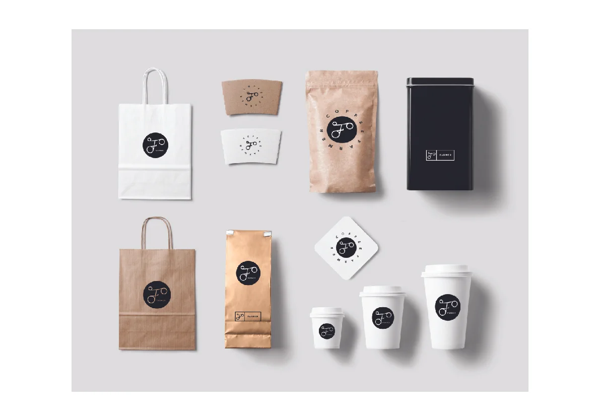

The final identity strikes a balance between urban simplicity and rural authenticity. It feels clean enough for a modern café in Shanghai, yet warm and human — just like the founder himself.